Monday, December 6, 2010

I See Interfaces


For my final blog post, I'll briefly mention the SixthSense system. It is a interface system that is mounted on an individual. It consists of a camera (like a webcam), a small projector, and color markers to be worn on your fingers. It allows you to draw on a projected screen, or take a picture simply by outstretching your hands. It will show a browser, or project a telephone keypad on your hand.

But the most impressive features are the ones that interact with physical objects. For example when looking at a book it might scan the cover and show recent reviews. Or in one of the videos here, a man examines a package at a grocery store and more information about the product is displayed (along with interactive buttons).

It seems to me this is a very new idea. Computing power has been mobile for a while, but that means interacting with a small computer you carry around. Here you are interacting with the world with the help of computers.


Saturday, November 20, 2010

Grooveshark

Since taking an interface design class I find myself paying closer attention to the interface designs I frequently encounter. One such layout is Grooveshark's play queue. Like Pandora, upcoming songs are listed in boxes, with the currently playing song on the left and upcoming songs stacked to the right. Each contains the name of the song (full title available on hover), album, and a picture of the album. Clicking the square causes the song to start playing (or pause if it was already playing). There are also buttons to remove the song from the queue or add it to one of your existing playlists. But best of all, rearranging the songs in the queue is as easy as dragging and dropping the squares as desired.
It seems to be part of the Grooveshark style to have multiple ways to do the same thing. Adding a song to a playlist can be done by clicking the down arrow on the song's square box, or by simply dragging the song onto the playlist's name. In this case I think the multiple ways does not cause confusion but just makes things more intuitive. I find myself just trying to doing things (mostly by drag and dropping) and things work. It's wonderful.


Sunday, November 14, 2010

Wii, Move and Kinect

Thanks to our System Interface class, we've been able to play around with the Wii, Playstation Move, and Kinect. I wanted to offer my reflections on my experience.
With the Wii I was able to use one arm to interact with the game. I could wave my hand around to direct things, swing a racket, whatever. With additional equipment I could include other parts of my body. We had a balance board in the lab which meant I could interact by shifting my weight.

With the playstation move I could use multiple controllers at once (this may be possible with the wii, I'm not sure). In effect my whole upper body could be involved with the game. I could hold a sword in one hand and a shield in another. But to move my avatar left or right I needed buttons (and the playstation buttons were more user friendly than the Wii's).

But with the Kinect every part of me was involved with the game. I started playing a dodgeball sor to f game. I was fun knocking the balls around with my arms. But then someone told me to use my legs. I was blown away. What?! I can use my whole body? (I was aware of this fact on some level). My experience with the Wii and PlayStation Move had had my legs planted. But I immediately began kicking and shuffling. I found myself testing the sensitivity of the avatar by dancing between levels.
In short, I was quite surprised at how well the Kinect worked. The whole thing felt very different from a traditional video game. For one thing it was pretty social. There were 4 of us in the lab and we were all participating to different degrees. And since there was no controllers or buttons it seemed much more like a fun indoor game than anything else.

Now granted, I have a hard time imagining playing halo on the Kinect. A certain amount of precision and complexity is granted a user with buttons. But in terms of fully interactive games, the Kinect beat the competition.

Elevator Interface

(Post for the week of 11/08/10)
This last week I was able to go to New York City for a job interview. In the building of the business I was interviewing at I was struck by a new (to me) way to interact with elevators. On the ground floor there was a metal post sticking out of the ground. The post was a little thinner than a phone line pole. It had 4 faces. One one face there was a screen and a set of buttons (exactly like a pay phone, the digits 1 through 9 in a 3x3 grid with 0 centered at the bottom). As I looked at it, a man in a suit walked up and punched in a floor number 43 on the keypad. After about a second the letter F flashed on the screen and he headed off. This drew my attention to the actual elevators. There were 4 elevators on each side of the hall, each with a letter of the alphabet above it. Perhaps not surprisingly the well dressed man was now in front of the one labeled L. Getting the gist I entered my floor number and headed to the appropriate elevator. There was no up down buttons next to the elevator. When the door opened I could see a panel on the inside with the numbers of the floors it was shortly departing to.

Reflecting on this, I think this system was pretty easy to learn. I watched one person and could figure it out. I reckon this system helps improve elevator efficiency. It required a bit more thinking on each user's part (remember which alphabet letter to go to). But there was no need for any buttons inside the elevators.

Monday, November 1, 2010

Smart Meters

In a recent forum event at Notre Dame (video available here) a panel composed of Notre Dame faculty discussed the impact of technology on the common good. A recurring theme was the green movement and the pushes to monitor energy consumption better. One of the panelists ,the Dean of Engineering Peter Kilpatrick, described his experience with learning more about his personal energy consumption. He explained that he had never been much interested in his gas mileage. But once he got a car that had a display showing his current mpg, he found he kept track and it interested him. Similarly he moved into a home with a smart meter and found he know keeps track of how much energy he uses at home.
I was intrigued by the idea that the mere presence of information (not necessarily even requested or desired) could lead people to change their behavior. This also s
eems like an area where a helpful user interface could really help. Compare the difference between these two new sma
rt meters. Both could contain the same info, but the display helps greatly.

Monday, October 25, 2010

Malcolm Gladwell's "A Small Change"

For this post I'll briefly reflect on Malcolm Gladwell's article titled A Small Change (available here).

I found this article extremely persuasive and it rings true with my experience of social networks. The groups I find myself most often invited to on Facebook are trivial causes requiring little to no action on my part. I appreciated the distinction between “strong-tie” and “weak-tie” relationships that Malcolm draws. What could joining a facebook group actually do? It’s so easy to ignore Facebook groups, but it’s much harder to ignore a sit-in.

Movements need muscle; people willing to take action, even if that action is simply casting a particular vote. But social networks don’t provide any muscle, they just provide a forum.

The digital activism associated with President Obama’s election would seem to be a strong counterexample to Gladwell’s claims. The Obama campaign did effect a great change, the election of the first black president as well as a solid victory for a candidate that was relatively unknown prior to the campaign. The campaign involved all sorts of social online mediums. There were facebook groups, youtube video, twitter, online donation possibilities, online Q&A sessions. Isn’t the election of President Obama the shining example of modern day social activism through social networks?

First what the campaign asked of its participants was (comparatively) simple: vote a particular way on the ballot. Voting is a simple, easy, non-dangerous (at least in America) way to potentially cause great change. It just takes a few minutes, is confidential and yet has impact for years. I think Gladwell would argue this voting is (somewhat by design) an unusually effective easy way to effect change.

Secondly the Obama campaign seems to have involved quite a bit of hierarchical organization (a necessary component of successful activism). This hierarchy did not emerge from social networks but was rather imposed upon them (source). The campaign architect explained “We wanted to control all aspects of our campaign. We wanted control of our advertising, and most important, we wanted control of our field operation.” So although the campaign used social networks in its work, it did not grow out of them.
Monday, October 11, 2010

A Few Reason I Think PowerPoint is Awesome

I've always been quite a fan of Powerpoint. Now I'll be quick to point out that I'm not saying I love all the lectures and presentations I've been given with PointPoint. However I think PowerPoint is just wonderful for making diagrams and posters. In the last three days I've used Powerpoint to
  • make a sign indicating that a bathroom should not be used
  • make a floorplan showing where to position tables for a party
  • show the strengths, weaknesses, opportunities and threats of Raytheon for a class report.

And the remarkable thing is it
was fun making all these diagrams. I was actually looking forward to doing some of this work in Powerpoint. And it was easy!

What I think make PowerPoint such an enjoyable and easy to useprogram to use is its user interface. There's much to say here, but I'll focus on a couple features I particularly like:

Rotation
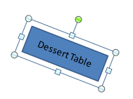
Whether it's arrows or a table or an image I could not imagine rotating images to be any easier. Clicking on the item displays nodes around it. The nodes can be grabbed to resize, but there is also a green node that rotates the object. It's nearby (Fitt's Law) and if the snap-to-grid setting is enabled (the default) it's easy to get things exactly horizontal or vertical.


Grouping
Combined with copy-paste, the ability to group things together is very useful. It reminds me of object oriented program. I can combine a textbox and shape and make it a "table". Then I can create a new table (copy-paste), or change the size of the table and the textbox will change size automatically. All it takes is selecting multiple elements and then right clicking (again having this option be one of the few in the dropdown menu means it does not take long to get to it -- valuable given that clicking anywhere else would lose the focus on the items to be grouped).